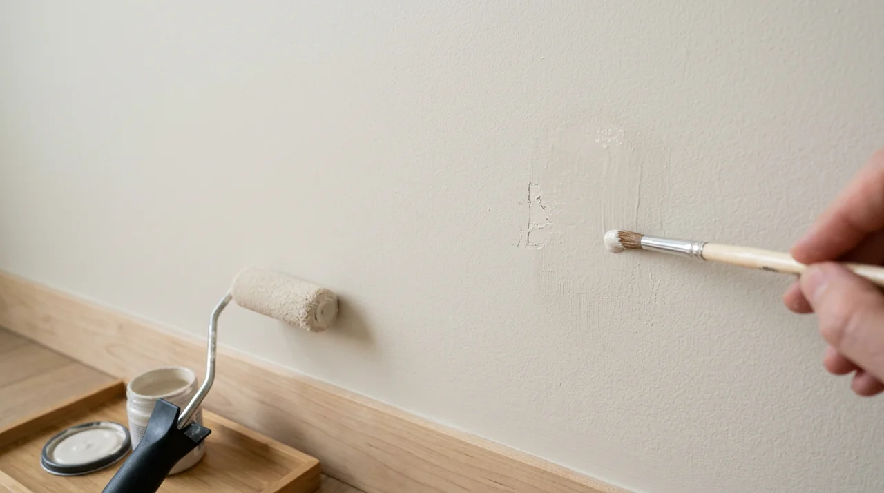


Thinking about painting your walls and trim the same color? This design trend has been growing for years, and it’s changing how people think about their homes. Instead of painting trim white or a contrasting shade, you use one color for everything: walls, baseboards, door frames, window casings, and crown molding.
The catch? This choice isn’t right for every room or every person. You need to understand both the good and the bad before you commit to painting. What works beautifully in one space might fall flat in another.
In this guide, we’ll walk through the real pros and cons of matching your wall and trim colors. You’ll learn when this approach works well, when contrasting colors are better, and how to make the right choice for your space. You’ll have the confidence to decide what’s best for your home.
Comparing Painting Walls and Trim the Same Color
Should you paint your walls and trim the same color? The answer depends on your home’s architecture, your style preferences, and what you want to highlight. Here’s a direct comparison to help you decide.
|
Factor |
Pros |
Cons |
|
Visual Impact |
Makes rooms look and feel bigger by removing visual breaks. Eyes move smoothly around the room. Works with both light and dark colors. |
Trim details can disappear. The room can look flat, like a two-dimensional visualization. Crown molding and baseboards go unnoticed. |
|
Design Style |
Brings a modern, polished look. Adds instant class with seamless appearance. Works in new homes and historic houses alike. |
Removes traditional definition. Traditional homes can lose character without crisp white trim. Doesn’t suit everyone’s personal style. |
|
Architectural Features |
Brings unity to complicated spaces with built-ins, wainscoting, and beadboard. Calms visual clutter while textures still show through. |
Doesn’t highlight architecture. Hides investment in detailed trim work. Crown molding, door frames, window casings, chair rails, and historic features fade into the background. |
|
Bold Statements |
Perfect for dramatic, bold statements with deep colors like purple, navy, forest green, or rich red. Creates rich, moody spaces that feel special. |
Not ideal for every room or style. Low-light rooms might feel too dark. May never feel right if you love classic, traditional homes. |
|
Design Focus |
Let’s other design elements shine. Furniture, artwork, light fixtures, and accessories pop against a solid backdrop. The room becomes about your belongings. |
Some spaces just need contrast to look right. Blurred walls and trim can feel unfinished to some people. |
|
Painting Process |
Easier painting process with less masking tape, no stress about getting trim paint on walls, one color choice, faster decisions, simpler planning. Accidents don’t matter. |
Still requires two different paint products. Wall paint needs a flatter finish. Trim paint needs durability. Buying two products at different prices. |
|
Maintenance |
Simpler maintenance and touch-ups. Only need one paint color. No remembering which white you used. Touch-ups blend perfectly. |
Color matching can be tricky with different sheens. Semi-gloss trim can look different from flat walls. Need to test colors with different sheens first. |
|
Sheen Options |
Works great with different sheens. Use flat or eggshell on walls, semi-gloss or satin on trim. Creates a subtle distinction while maintaining color unity. |
Not every color works well with this approach. The sheen difference is especially noticeable with dark colors. May lose trim durability if using eggshell everywhere. |
The choice depends on what matters most to you. If you want a modern, spacious feel and easier maintenance, matching walls and trim works well. If you love traditional style or want to showcase beautiful woodwork, contrasting trim is the better choice.
When Matching Colors Works Best?
So when should you actually use this technique? Certain rooms and situations are perfect for matching wall and trim colors. Let me show you where this approach really shines.
The decision to match your walls and trim depends heavily on your specific space and what you’re trying to achieve. Here are the situations where this technique delivers the best results:
- Small rooms and tight spaces: Small spaces get the biggest benefit from matching colors. The unified look tricks your eye into seeing more space than is actually there. Bathrooms that feel cramped, small bedrooms, hallways packed with doors, closets, mud rooms, and any space under 100 square feet all benefit from this approach. The technique works because there’s no visual break, so your tiny bathroom suddenly feels less boxed in, and that cramped bedroom breathes a little easier.
- Rooms with complex trim work: Spaces with lots of trim pieces can look messy with contrasting colors because all those different elements fight for attention. Matching everything calms the chaos. Your built-in bookcases blend with the walls, wainscoting doesn’t chop up the room, and multiple windows and doors stop creating visual noise. Crown molding, chair rails, and beadboard walls become part of the whole design instead of separate competing features.
- Creating cozy, intimate spaces: Dark, matching colors wrap the space in warmth and create a room that feels like a hug. This works great for dining rooms in deep navy or forest green, reading nooks and dens, powder rooms with bold colors, bedrooms where you want that cocooned feeling, and any space meant for unwinding. The same color on walls and trim creates that wrapped, protected feeling where people naturally relax.
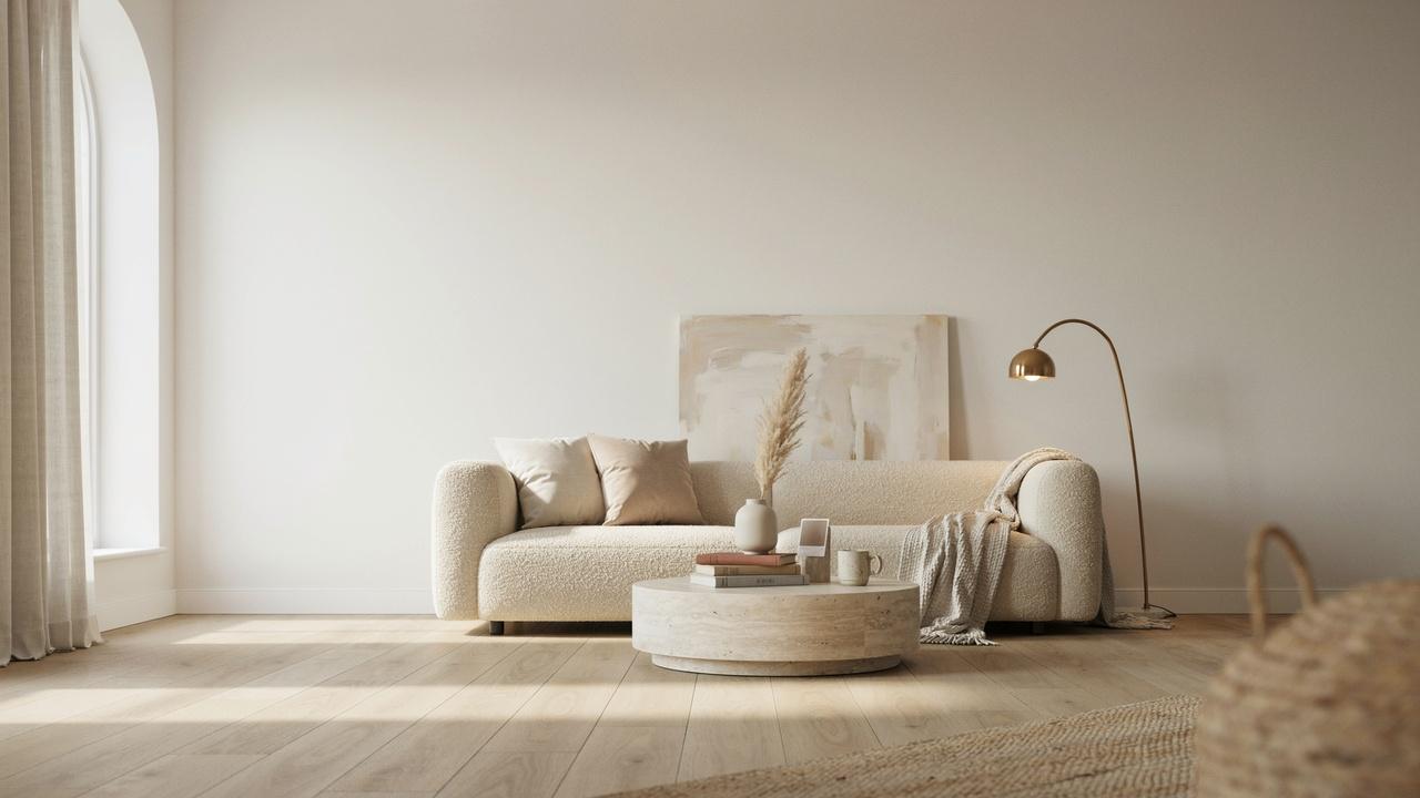
- Modern and minimalist design styles: Clean, simple design loves this technique. If your style leans modern or minimalist, matching colors should be your go-to move. Contemporary homes look even better with unified color schemes, and spaces with minimal decoration need that smooth backdrop. Your furniture and art become the focus, which is exactly what minimalist design wants.
- Open floor plans with flow: Spaces that connect benefit from color continuity. When living rooms flow into dining areas and kitchens, matching walls and trim creates seamless transitions. The unified approach helps large, open spaces feel cohesive rather than choppy. This works especially well in modern homes where rooms aren’t separated by doors and distinct boundaries.
When Contrasting Trim Might Be Better
Matching colors isn’t always the answer. Sometimes you need that crisp white trim to make your space work. Let’s look at when contrast is the smarter choice.
Contrasting trim serves important purposes in certain homes and situations. Here are the key scenarios where you should stick with traditional white or contrasting trim:
- Showcasing beautiful woodwork: If you have amazing trim, show it off. Detailed moldings deserve to be noticed, not hidden. Properties with hand-carved details, historic homes with original woodwork, spaces with thick chunky moldings, and traditional or classic design styles all need contrasting trim. You paid good money for that trim work, so white or contrasting trim puts a spotlight on those details instead of hiding your best architectural features.
- Creating visual interest: Contrasting trim adds instant personality and gives your eyes something to follow around the space. Plain walls need definition to avoid feeling flat or boring. Large, empty wall areas can feel overwhelming without a break, and contrasting trim creates those breaks naturally. Your room goes from blah to interesting with just that one design choice.
- Brightening up dark spaces: White trim reflects light, which is crucial for rooms with little natural light. Dark rooms need all the help they can get, and bright trim bounces available light around the space. Basements, north-facing rooms, and spaces with small windows benefit enormously from the light-reflecting properties of white or light colored trim against darker walls.
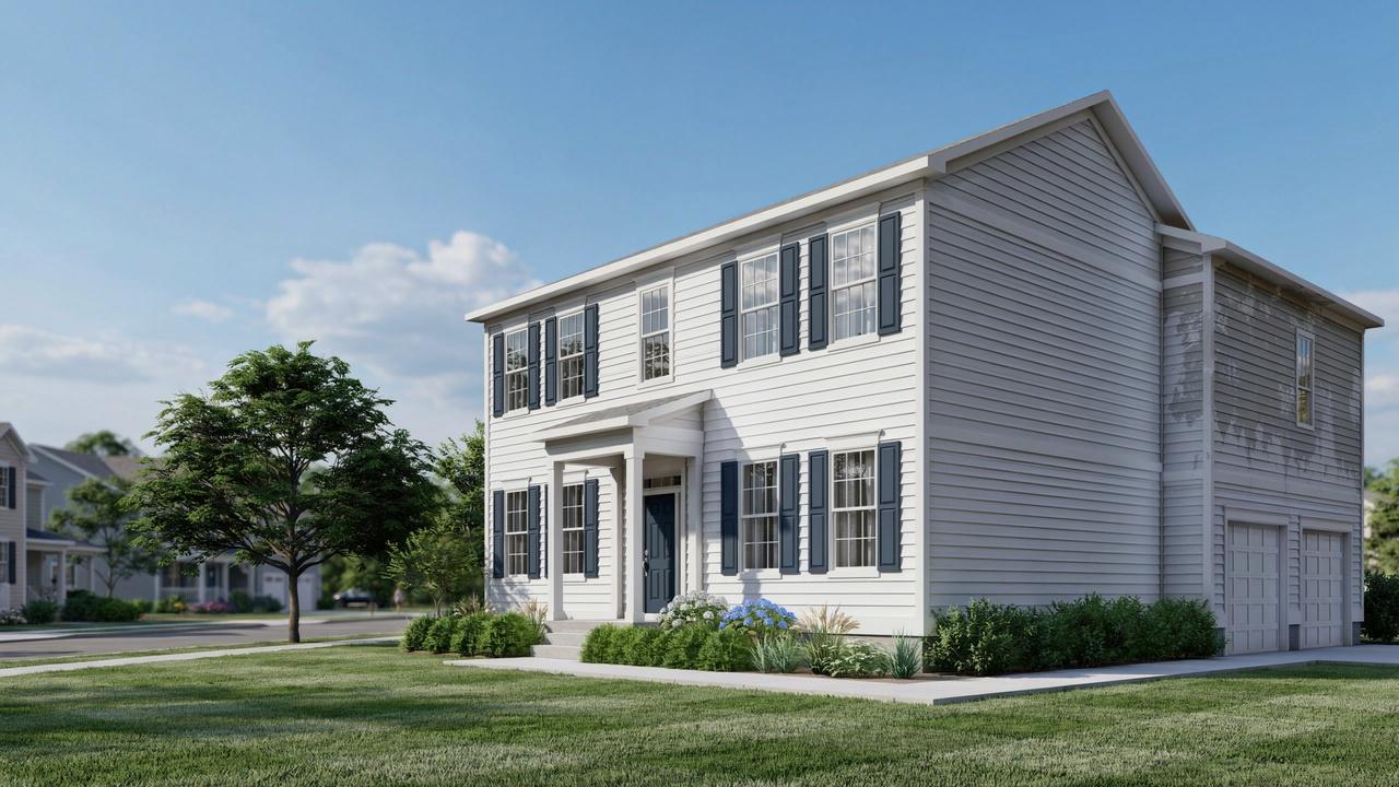
- Traditional and classic home styles: Some architectural styles simply look wrong without contrasting trim. Colonial homes, Victorian houses, Craftsman bungalows, and farmhouse styles were designed with trim as a defining feature. These homes lose their character and historical accuracy when you paint everything one color. The contrast is part of the original design language.
- Adding structure to open layouts: Large, open spaces can feel undefined without visual anchors. Contrasting trim creates structure and helps define different areas within one large room. It marks doorways, windows, and transitions between spaces, which helps the eye understand the layout. Without this definition, open floor plans can feel chaotic or confusing rather than spacious and flowing.
Think about problem areas like basements with tiny windows, interior rooms with no outside walls, or north-facing rooms that lack sunlight. White trim bounces light around and makes the whole room brighter. In dark spaces, that contrast isn’t just pretty, it’s functional.
How to Choose the Right Color for Your Project?
Picking the right color makes or breaks this whole approach. Some colors work great for matching walls and trim, while others cause problems. Let me help you choose wisely.
Best Colors for Same-Color Approach
Certain colors are proven winners for this technique. I’ve seen these work over and over in different homes and lighting situations.
Your safest bets:
- Soft whites and off-whites like White Dove or Snowbound
- Warm neutrals such as beige, greige, and taupe
- Cool grays in light to medium tones
- Bold jewel tones like navy, emerald, or burgundy
- Dusty pastels, including soft pink, sage green, and light blue
These colors hide the sheen differences between wall and trim paint. They look consistent in most lighting. Start with one of these if you’re new to matching colors.
Colors to Be Careful With
Not every color is your friend here. Some shades create headaches you don’t need. They either show too much sheen difference or just don’t look right.
Very dark colors are tricky. That semi-gloss trim can look totally different from flat walls in deep charcoal or black. Bright, saturated colors overwhelm a room when they’re everywhere. Some colors shift dramatically from morning light to evening light, which gets confusing. Trendy colors might look dated in a few years, and you’re stuck with them on everything.
Testing Your Color Choice
Never skip the testing phase. I can’t stress this enough: samples save you from expensive mistakes.
Get paint samples and put them on your walls. Look at them in morning light, afternoon light, and evening light. Colors change throughout the day more than you think. Check how the color looks next to your flooring and furniture. Live with those samples for at least 24 hours before deciding. Use large sample boards that you can move around the room to see the color in different spots.
Tips for Successfully Painting Walls and Trim the Same Color
Ready to actually do this? Good technique makes the difference between a pro look and a mess. Follow these tips to get it right the first time.
Getting the best results when painting walls and trim the same color requires attention to specific details. Here are the essential tips for a professional-looking finish:
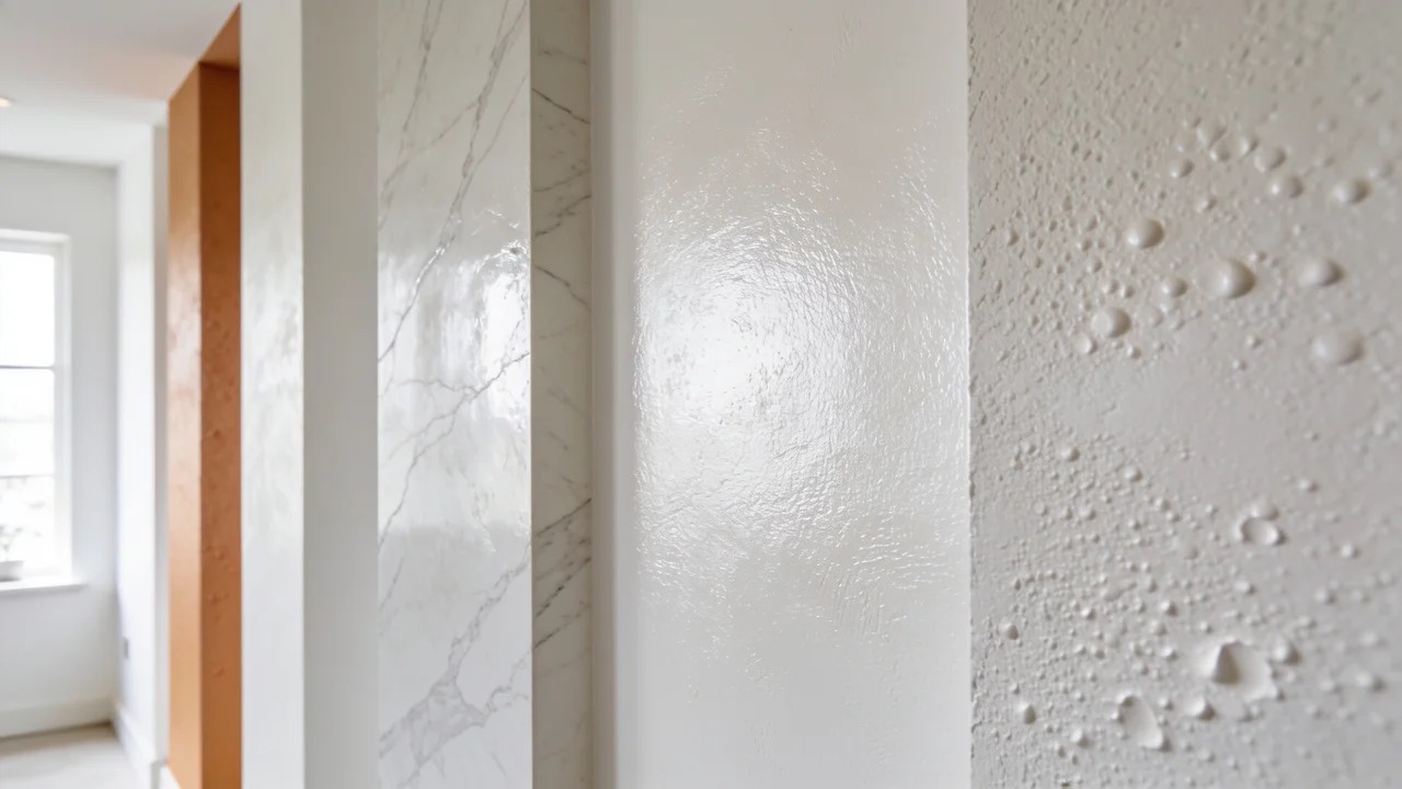
- Select the right paint sheens: The sheen is just as important as the color, and this is where most people mess up. Use a flat or eggshell finish on your walls to hide imperfections and create a soft look. Then use semi-gloss or satin on the trim for durability. The higher gloss on trim adds subtle definition that keeps things interesting. Exception: if you’re using dark colors, consider eggshell on everything to avoid sheen mismatch problems.
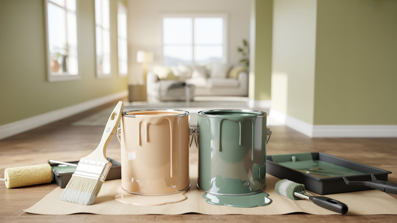
- Use proper painting technique: You still need to paint trim and walls separately, so don’t get lazy just because the color matches. Use quality brushes for trim work because cheap brushes leave marks. Rollers work best for walls and cover faster. Apply at least two coats to everything for good coverage, and let each coat dry completely before adding the next one. Rushing the drying time causes problems you’ll regret.
- Handle different materials correctly: Wood and drywall are different materials that need different prep work. Prime wood trim with wood primer and prep drywall with drywall primer. Use the right paint formula for each surface and never skip primer because it’s the foundation that makes your paint job last. Sand trim smooth before painting to ensure an even finish.
- Test colors with actual samples: Take your time with the final call because this isn’t a decision to rush through. Get paint samples and test them on your actual walls with your actual lighting conditions. Look at the samples in morning light, afternoon light, and evening light to see how they change. The color on a small chip looks completely different when it covers an entire wall.
- Consider your room’s specific factors: Think about your room’s lighting and whether it gets bright sun or stays dim. Consider your room size and ceiling height, as the same color can feel different in a tall room versus a low-ceilinged space. Look at your existing furniture colors and make sure everything works together. Count how much trim you actually have, because rooms with lots of trim show the technique differently than minimal trim. Most importantly, trust your gut, and if a color feels wrong, keep looking until you find one you love.
Conclusion
The pros and cons of painting trim the same color as the walls come down to your personal needs. Matching colors makes rooms feel bigger and creates a modern look, but contrasting trim showcases beautiful woodwork and adds definition.
Start with one room to test the approach. Take your time picking colors. The right choice is simply the one that makes you happy when you walk into the room. Remember, it’s just paint. You can always change it if you don’t love it.
Trust your gut and create a space that feels like home. What’s your take on matching wall and trim colors? Have you tried it in your home? Drop a comment below and share your experience.
Frequently Asked Questions
Does painting walls and trim the same color make a room look bigger?
Yes, it does. When you use one color throughout, you remove visual breaks that chop up the space. Your eyes see the room as one unified area instead of separate sections. This works with both light and dark colors, making even small rooms feel more open and airy.
Do I need different paint types for walls and trim if they’re the same color?
Yes, you still need two different products. Wall paint has a flatter finish for drywall. Trim paint is more durable with a shinier finish because trim gets touched and bumped more. Same color, different formulas. You can’t save money by buying just one type.
What paint sheen should I use on walls versus trim?
Use flat or eggshell on walls for a soft look. Use semi-gloss or satin on trim for durability and subtle shine. With dark colors, consider using eggshell on everything to avoid sheen mismatch. The different sheens create subtle definition while keeping the same color.
Will matching wall and trim colors hide my beautiful moldings?
Yes, matching the trim blend in rather than standing out. Your architectural details become less noticeable. If you have detailed moldings, crown work, or historic trim you want to showcase, contrasting colors work better. White or light trim highlights those features you paid for.
What colors work best for painting walls and trim in the same shade?
Soft whites, warm neutrals like beige and greige, cool grays, bold jewel tones, and dusty pastels work best. Avoid very dark colors that show sheen differences, bright saturated colors that overwhelm, and trendy colors that date quickly. Always test samples in your lighting first.