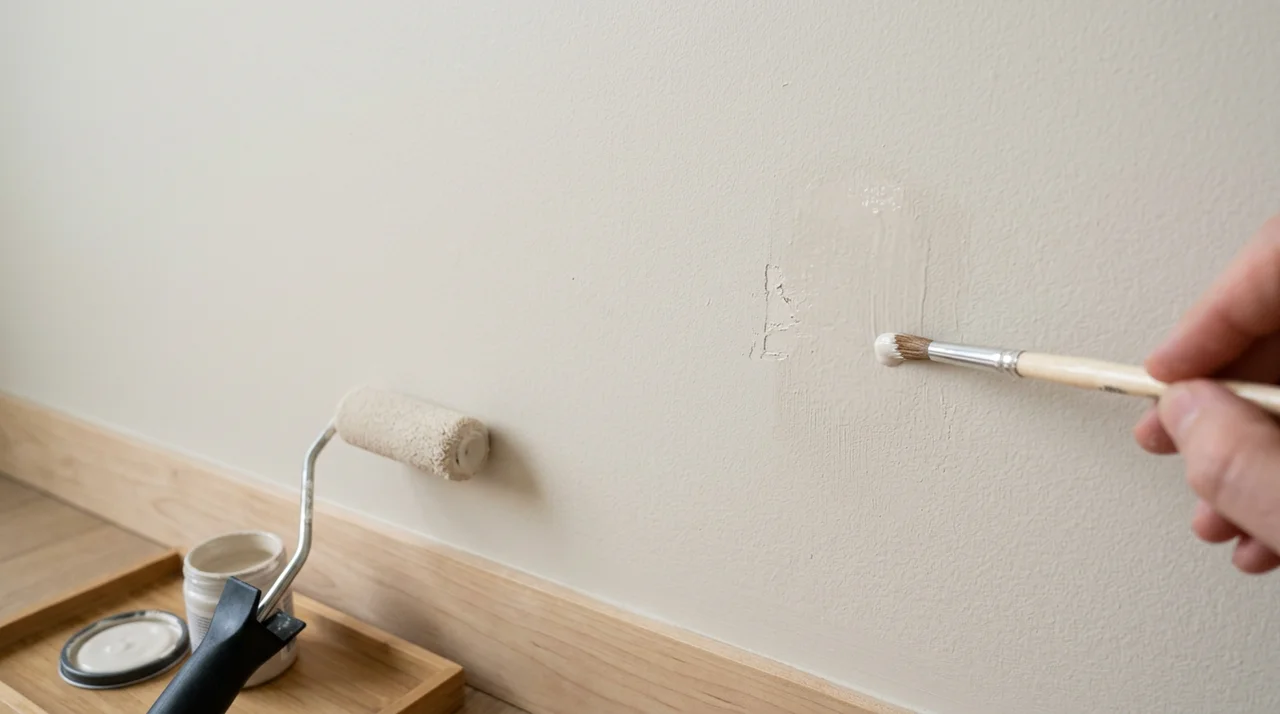


I've spent a lot of time helping people figure out the best basement paint colors, and I know how confusing it can get.
Basements are tricky. Low light, odd layouts, and moisture make color choices harder than any other room.
This guide covers everything you need. From light-reflecting whites to cozy neutrals and bold accent walls, I'll walk you through colors that actually work.
You'll learn how to pick shades based on your basement's lighting, layout, and purpose. I've tested and researched these options so you don't have to guess.
With years of experience in interior color selection, I'm here to make this easy for you.
How to Choose the Best Basement Paint Colors
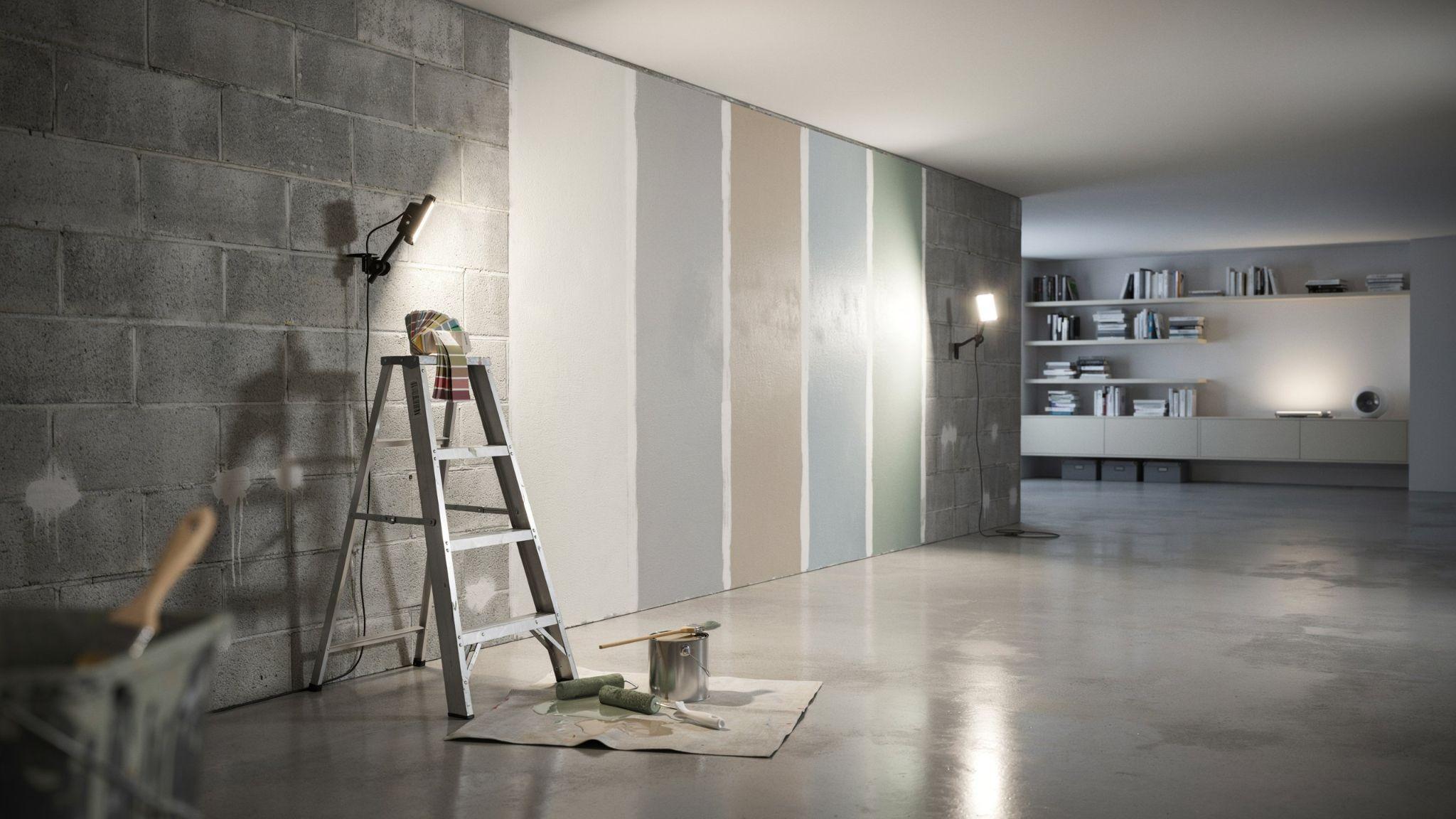
Picking the right basement paint color starts with understanding your space. Check how much natural light comes in, then look at your artificial lighting.
Warm bulbs shift colors yellow, while cool bulbs keep them accurate. Think about how you'll use the room, since a playroom and a home office need very different shades.
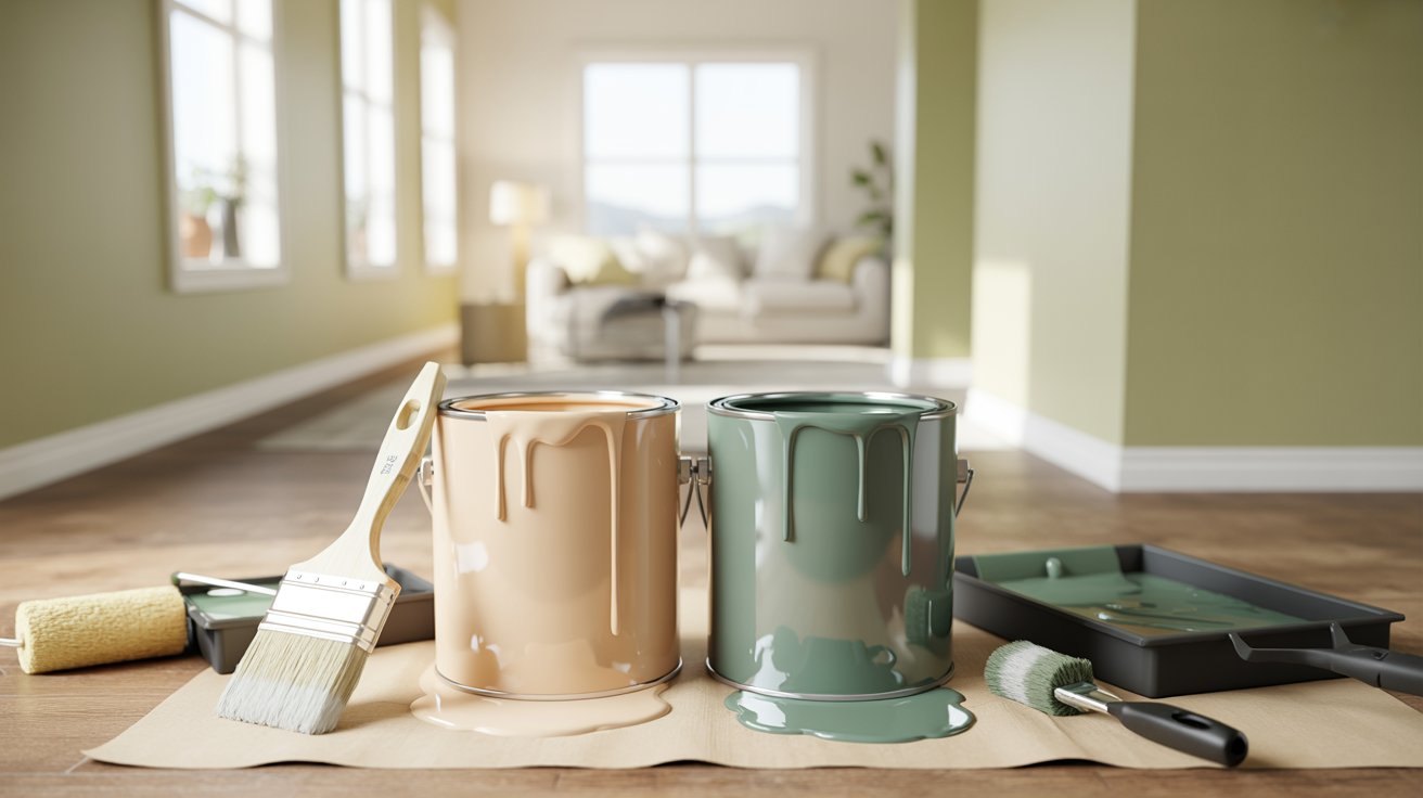
Look for colors with an LRV of 60 or higher to keep things bright. Hold paint swatches next to your floors and trim to see how they work together.
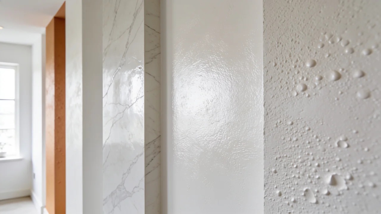
Finally, use a mildew-resistant formula with a satin or semi-gloss finish to handle basement humidity well.
23 Best Basement Paint Colors
These colors were chosen based on real basement conditions, including low light, moisture, and varied flooring types. Every shade on this list works well below grade.
1. White Dove (Benjamin Moore)
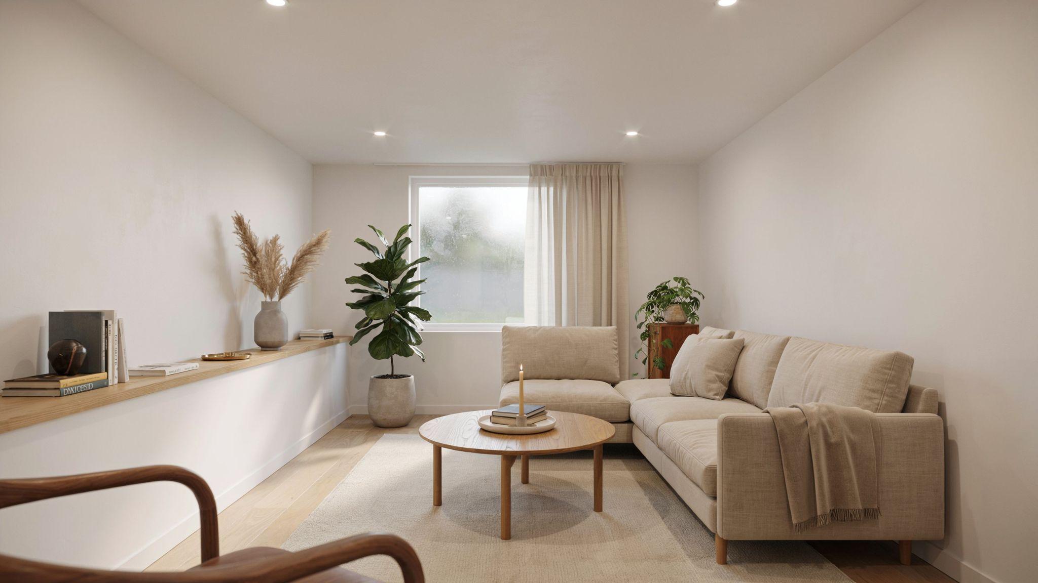
White Dove is one of the most recommended whites for basements, and for good reason.
It has a soft, warm undertone that keeps it from feeling cold or sterile, which is a common problem with bright whites in below-grade spaces.
This color works well with almost any flooring type, from hardwood to carpet to polished concrete.
It bounces light around the room and makes the space feel taller and more open.
If your basement has warm-toned trim or wood accents, White Dove will tie everything together without any effort.
2. Chantilly Lace (Benjamin Moore)

Chantilly Lace is a crisp, clean white with almost no undertone. It has one of the highest LRV ratings in the Benjamin Moore lineup, which means it reflects a lot of light.
This shade is best suited for modern or minimalist basements where the goal is to make the space feel as bright and open as possible.
Pair it with simple furniture and strong overhead lighting for the best result.
It also works well as a ceiling color when you want a seamless, airy look from wall to ceiling.
3. Revere Pewter (Benjamin Moore)
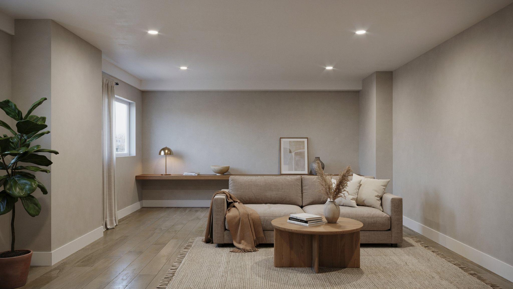
Revere Pewter is a warm greige that sits somewhere between gray and beige. It has been a popular interior color for years because it works with almost every style and lighting condition.
In basements, it adds warmth and depth without making the space feel heavy. It looks especially good under warm incandescent lighting, which brings out its golden undertone.
Pair it with cream-colored trim and wood furniture for a cozy, grounded look that feels welcoming from the moment you walk in.
4. Edgecomb Gray (Benjamin Moore)

Edgecomb Gray is a soft, light greige that is often described as the perfect neutral. It has just enough warmth to avoid looking cold but stays neutral enough to go with almost anything.
This is a great pick for basements that serve multiple purposes, such as a space that functions as both a family room and a home office.
It doesn't commit too strongly to any one style, which gives you flexibility.
Under natural or warm artificial light, it reads as a soft, sandy gray. Under cool LED lighting, it leans slightly more gray.
5. Pale Oak (Benjamin Moore)

Pale Oak is a light, warm beige with a touch of gray in it. It sits quietly on the wall without demanding attention, which makes it ideal for spaces where you want the furniture and decor to take center stage.
It works especially well in basement guest rooms and home offices where a calm, restful atmosphere is the goal. The warm tone makes the space feel inviting even without natural light.
Pair it with white or off-white trim to keep the look fresh and clean.
6. Hale Navy (Benjamin Moore)
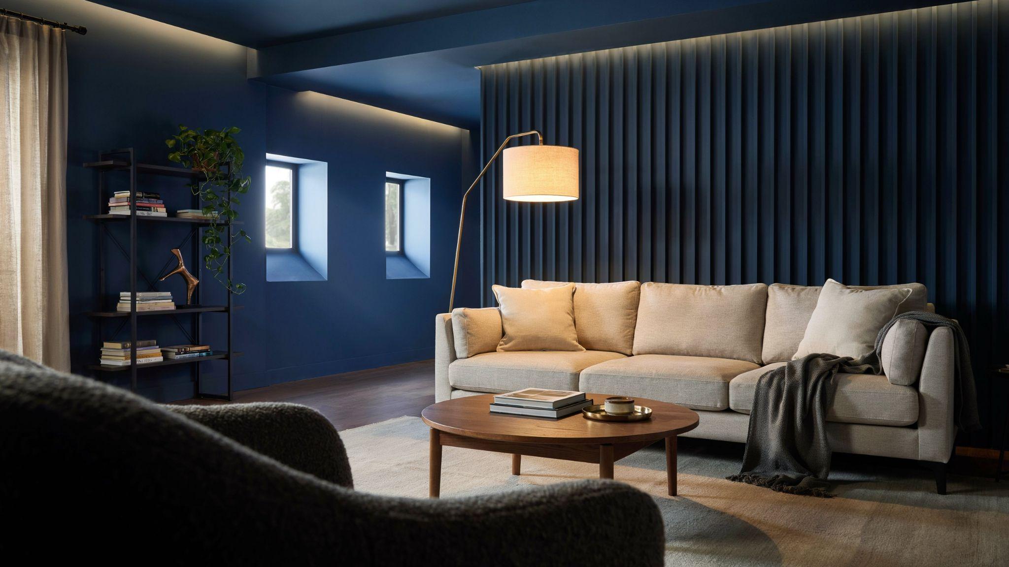
Hale Navy is a deep, rich navy blue that adds real depth and personality to a basement. It works best in spaces with strong artificial lighting, such as home theaters, game rooms, or bar areas.
This color creates a cozy, enveloping feel that many people love in entertainment spaces. It makes the room feel intentional and put-together rather than dark and dreary.
Use it on all four walls with warm brass or gold fixtures, and you'll have a basement that looks like it belongs in a design magazine.
7. Alabaster (Sherwin-Williams)

Alabaster is one of Sherwin-Williams' most popular whites, and it earns its place on this list easily. It is a warm, creamy white that reads soft and cozy rather than stark and cold.
Unlike bright whites, Alabaster doesn't show every imperfection on the wall. This makes it a practical choice for basement walls that may not be perfectly smooth.
It pairs well with warm wood tones, terracotta accents, and natural fiber rugs for a relaxed, lived-in look.
8. Agreeable Gray (Sherwin-Williams)
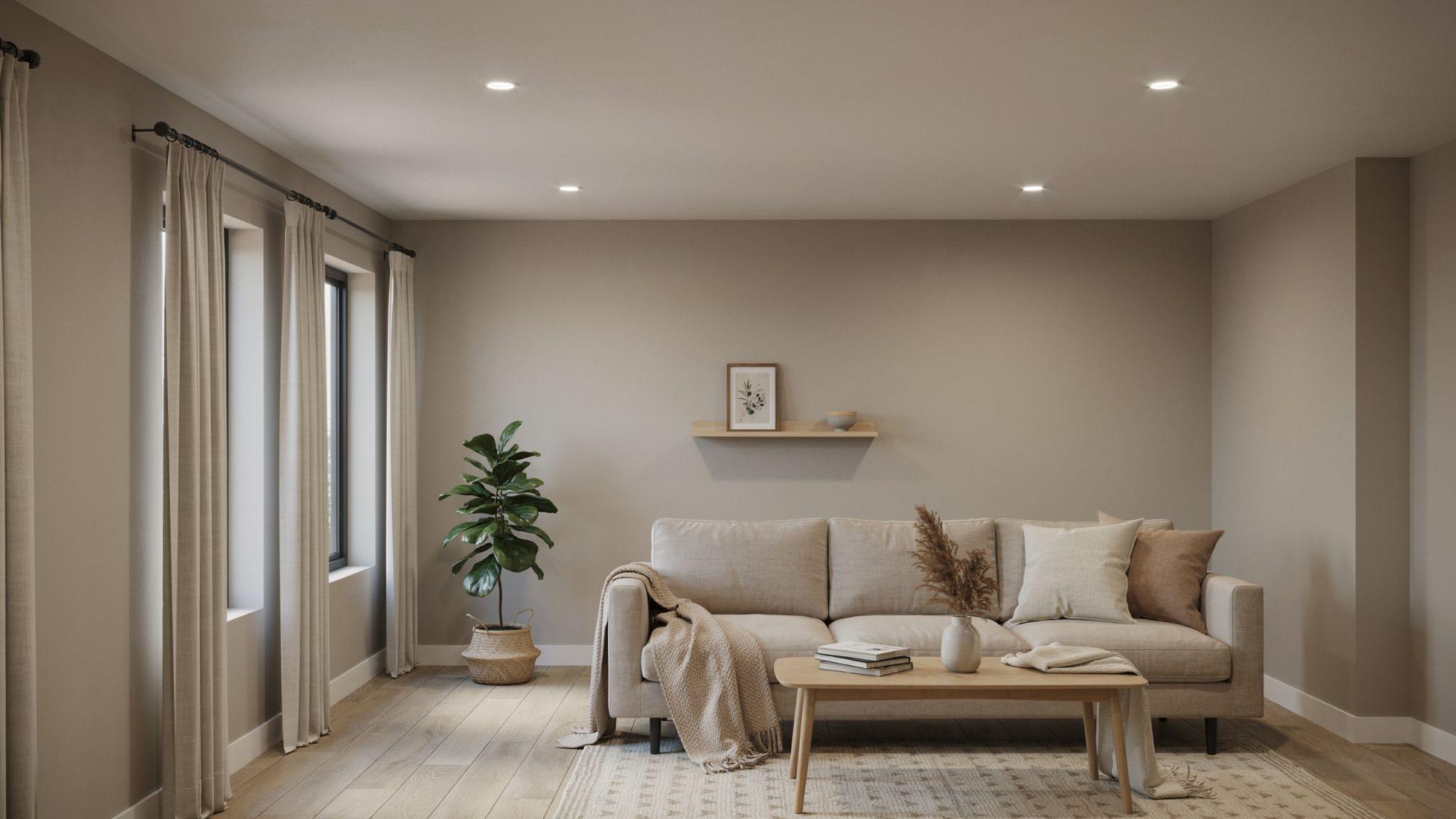
Agreeable Gray is the best-selling paint color from Sherwin-Williams for a reason. It is a warm gray with a beige undertone that reads as neutral in almost every lighting condition.
In basements, it strikes the perfect balance between light and warmth. It doesn't look yellow under warm lighting or purple under cool lighting, which makes it very reliable.
This is the color I recommend most often to people who are unsure what to pick. It works in nearly every basement style, from traditional to modern.
9. Drift of Mist (Sherwin-Williams)
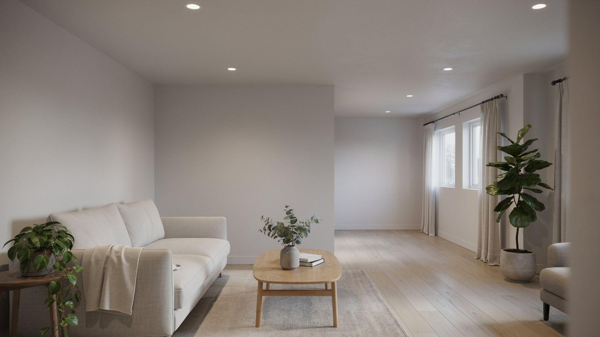
Drift of Mist is a very light, airy gray that sits close to white on the color scale. It has a cool, soft quality that works well in basements with bright overhead lighting.
This color is a good fit for Scandinavian or minimalist-style basements where the goal is simplicity and light. It pairs cleanly with white trim and natural wood accents.
If you want something lighter than Agreeable Gray but with a bit more character than plain white, Drift of Mist is the answer.
10. Repose Gray (Sherwin-Williams)
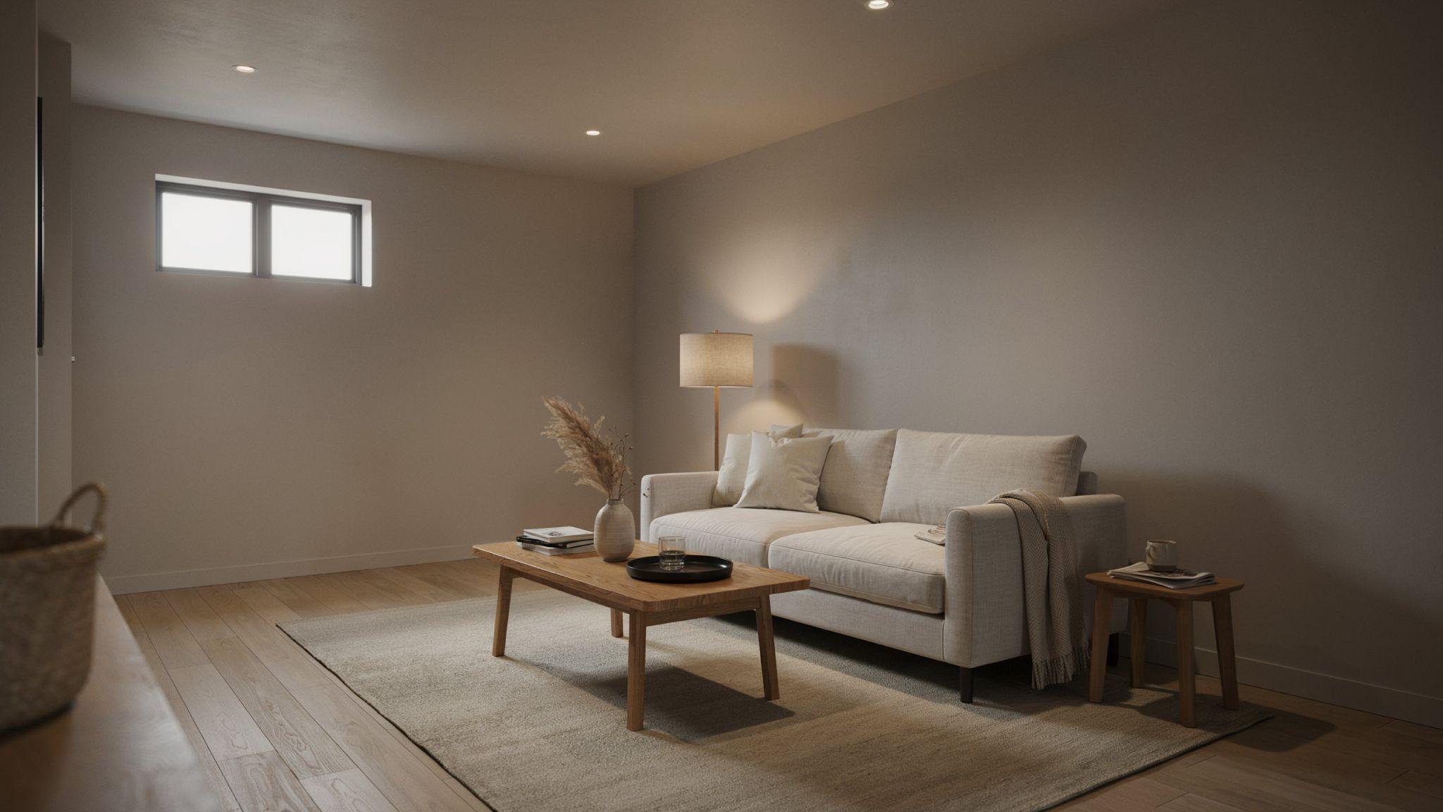
Repose Gray is a true neutral gray that doesn't pull warm or cool in most lighting conditions. It is one of the most versatile grays available and works across a wide range of decor styles.
In basements, it reads clean and polished without feeling cold. It's especially well-suited for open-plan basements where you need one color to work across different zones.
Pair it with crisp white trim and accent colors in navy, green, or terracotta for a look that feels current and well-considered.
11. Accessible Beige (Sherwin-Williams)
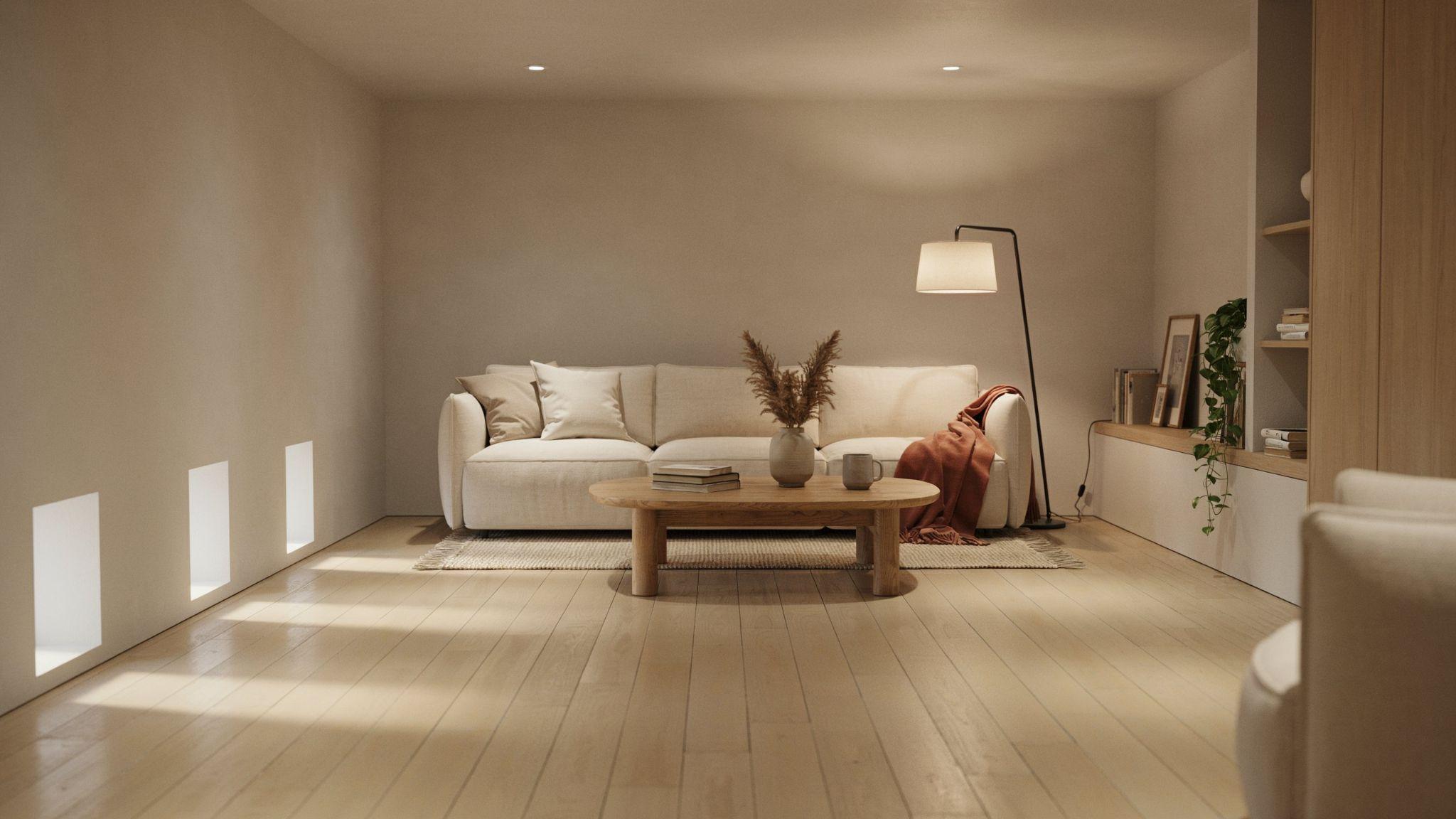
Accessible Beige is a warm, soft beige that feels grounded and comfortable. It is slightly darker than Pale Oak, which gives it a bit more presence on the wall.
This shade works well in basement family rooms and playrooms where you want the space to feel welcoming and relaxed. It doesn't demand attention but still adds warmth to the room.
It pairs especially well with wood-toned flooring and earthy decor pieces like wicker baskets, leather furniture, and linen upholstery.
12. Snowbound (Sherwin-Williams)
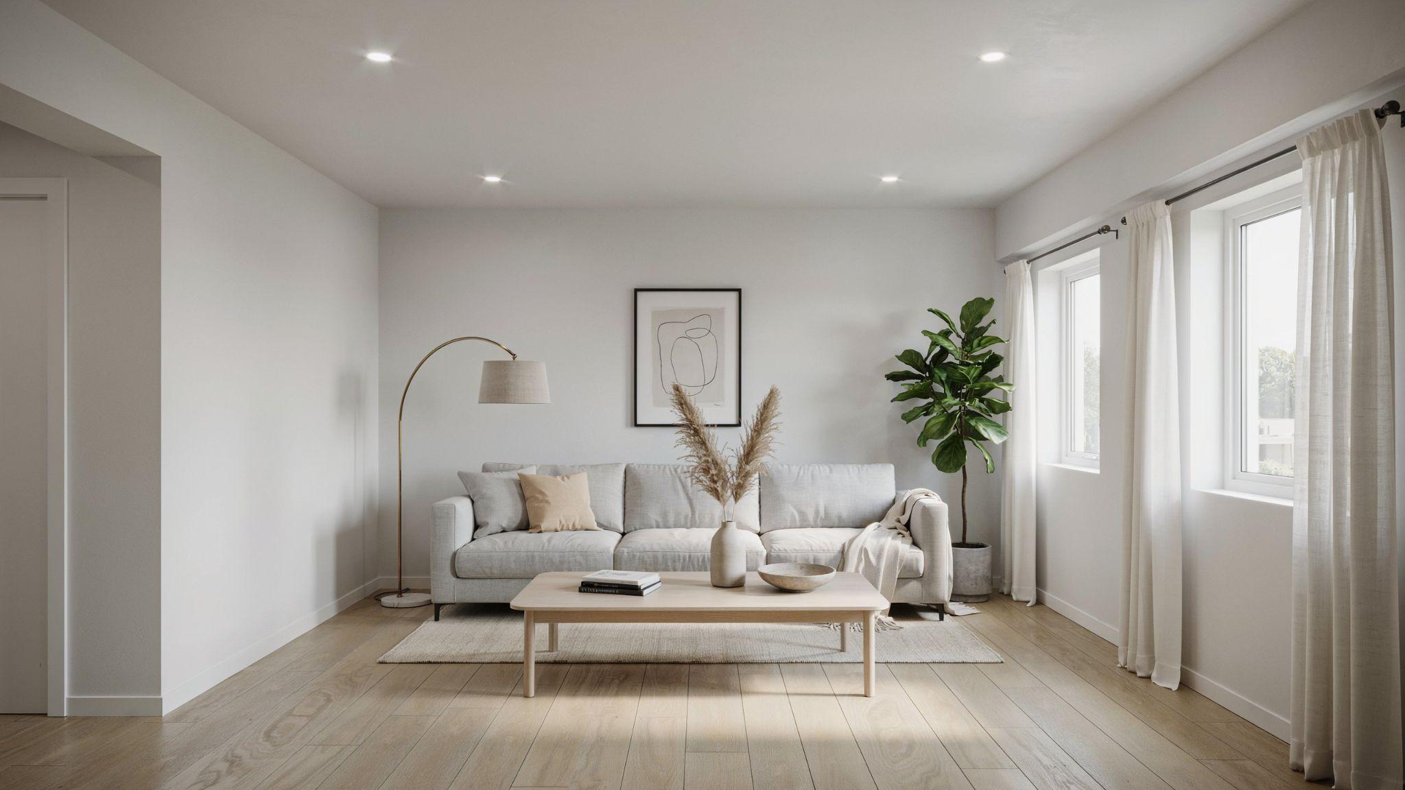
Snowbound is a bright, clean white with a barely-there warm undertone. It is one of the most popular whites for interior spaces because it reads as fresh without being harsh.
In basements with low ceilings, Snowbound on both the walls and ceiling can create a seamless, expansive feel. The light tone keeps the space from feeling compressed.
It also works well as a backdrop for bold furniture or artwork, allowing you to add color through decor rather than the walls.
13. Sea Salt (Sherwin-Williams)

Sea Salt is a soft, muted blue-green that has become one of the most loved paint colors in home design.
It brings in a sense of calm and freshness that works especially well in basement bathrooms, spas, and relaxation rooms.
In basements, it adds color without feeling heavy or overpowering. The muted quality of the tone keeps it from looking too saturated under artificial light.
Pair it with white trim, natural wood accents, and soft gray textiles for a spa-influenced basement look.
14. Iron Ore (Sherwin-Williams)

Iron Ore is a deep, dark charcoal that works brilliantly as an accent color or as a full-room shade in the right space.
It has a slightly warm undertone that keeps it from looking flat or harsh.
Use it in home theaters, game rooms, or basement bars where a dramatic, moody atmosphere is the goal.
The dark tone absorbs light, which reduces glare and creates an immersive environment.
Balance it with warm lighting and light-colored flooring to keep the space from feeling too closed in.
15. Swiss Coffee (Behr)
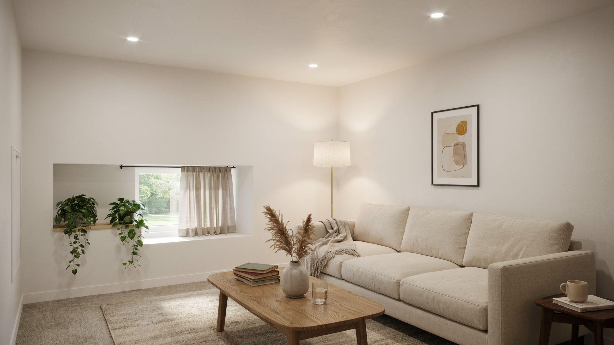
Swiss Coffee from Behr is a warm, creamy off-white that feels comfortable and welcoming.
It has a slight yellow-beige undertone that adds warmth without looking overtly yellow.
This is a great choice for basements that are used as main living spaces, such as family rooms or multi-purpose areas. The warmth of the tone makes the space feel lived-in and cozy.
It pairs well with both warm and cool-toned furniture, which gives you flexibility when decorating.
16. Silver Drop (Behr)
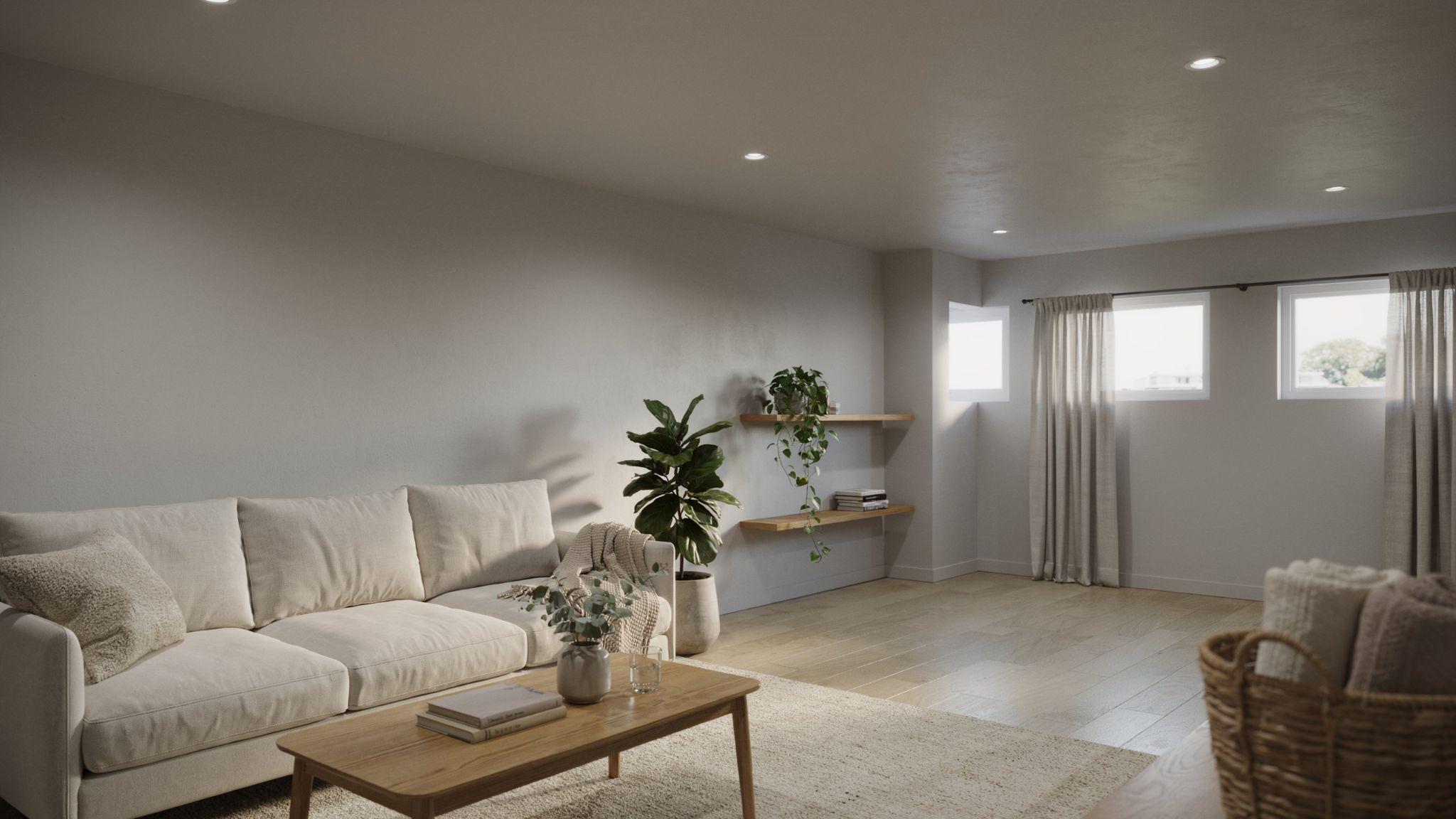
Silver Drop is a soft, light gray with a barely-there blue undertone. It reads clean and calm in most lighting conditions and works well in a range of basement styles.
This color is a good fit for modern and transitional basements where you want a neutral that still has a bit of personality. It's cooler than Agreeable Gray but warmer than a stark cool gray.
Use it with white trim and chrome or brushed nickel fixtures for a clean, contemporary feel.
17. Toasty Gray (Behr)
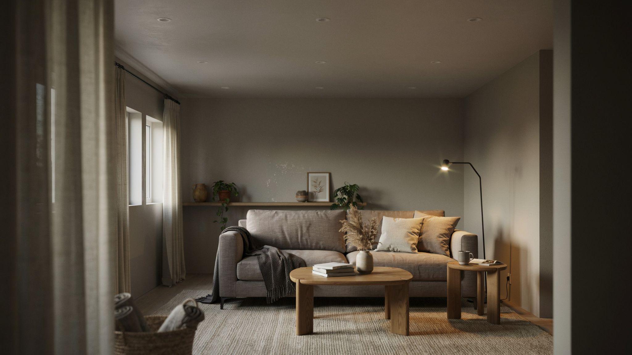
Toasty Gray is a warm, mid-toned gray with clear beige undertones. It lives squarely in the greige family and has a rich, cozy quality that works very well in below-grade spaces.
It adds more depth than lighter greiges like Agreeable Gray, which makes it a good pick for larger basements where you want the walls to have more presence.
Pair it with warm wood tones, cream accents, and soft area rugs for a space that feels layered and inviting.
18. Blueprint (Behr)

Blueprint is a medium-toned slate blue that adds real character to a basement. It's not as dark as Hale Navy but has enough depth to create a strong, confident look.
This color works well in home offices, reading rooms, and creative spaces where you want the environment to feel focused and intentional. The blue tone has a slightly cool, calming quality.
Pair it with warm wood furniture and cream accents to soften the cool tone and keep the space from feeling too formal.
19. Back to Nature (Behr)

Back to Nature is a soft, earthy green with a muted, natural quality. It brings in the feeling of the outdoors without being too saturated or bold.
This shade works well in basement spaces that are meant to feel calm and grounding, such as yoga rooms, meditation spaces, or informal lounges. It has a quiet, organic quality that is very easy to live with.
Pair it with natural textures like jute, linen, and rattan for a look that feels rooted and relaxed.
20. Tagsale Linen (Valspar)

Tagsale Linen is a warm, soft linen tone that sits between beige and cream. It has a light, airy quality that works well in basements with limited natural light.
This color is a good alternative to traditional whites because it adds warmth without the risk of looking yellow or dated. It feels fresh and light while still being warm.
It pairs well with both traditional and modern decor, making it a very flexible choice for multipurpose basement spaces.
21. Gravity (Valspar)
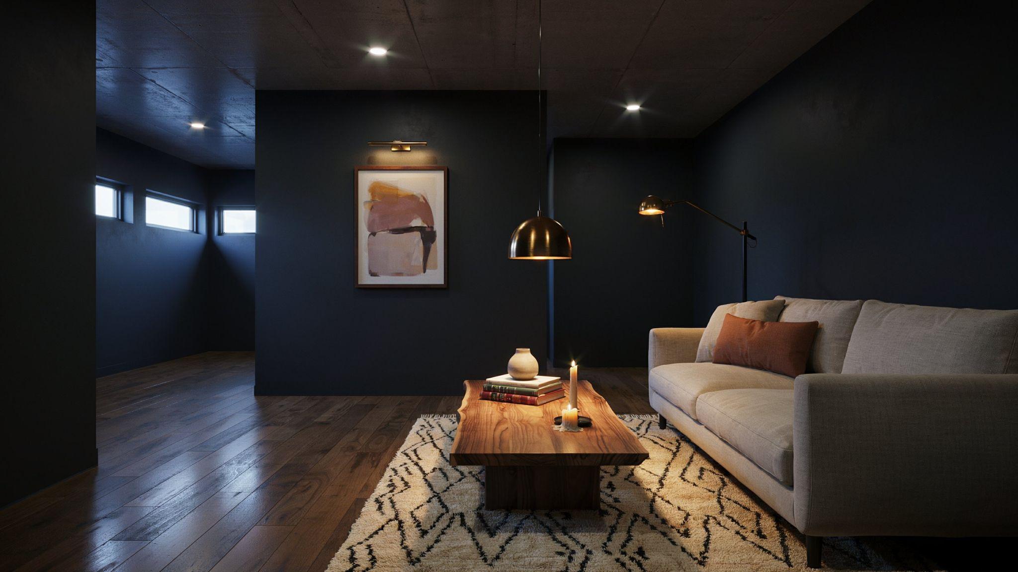
Gravity is a deep, dark charcoal gray from Valspar that sits in the same family as Iron Ore but with a slightly cooler tone.
It's a strong, bold color that works best in accent applications or rooms with strong lighting.
In a home theater or game room, Gravity on the walls creates a dramatic, focused environment. It pairs well with lighter flooring and warm accent lighting.
Use it sparingly or in spaces where the dark, moody quality is exactly what you are going for.
22. Filtered Shade (Valspar)
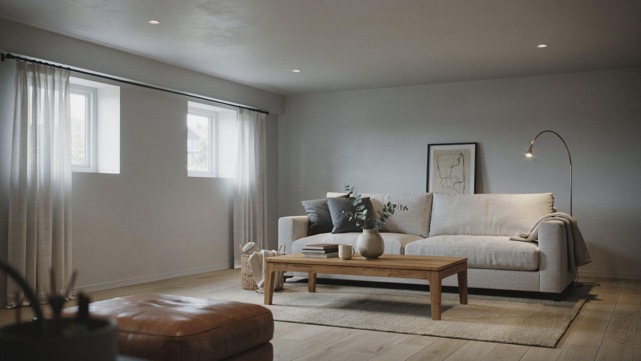
Filtered Shade is a soft, muted green-gray that has a calm, understated quality. It reads more gray than green in most lighting conditions but has just enough color to add interest.
This is a good pick for basement home offices or reading rooms where you want something a step beyond plain gray. The subtle green undertone adds depth without being too obvious.
It pairs well with warm wood tones, cream accents, and soft gray or white trim.
23. Cream Delight (Valspar)
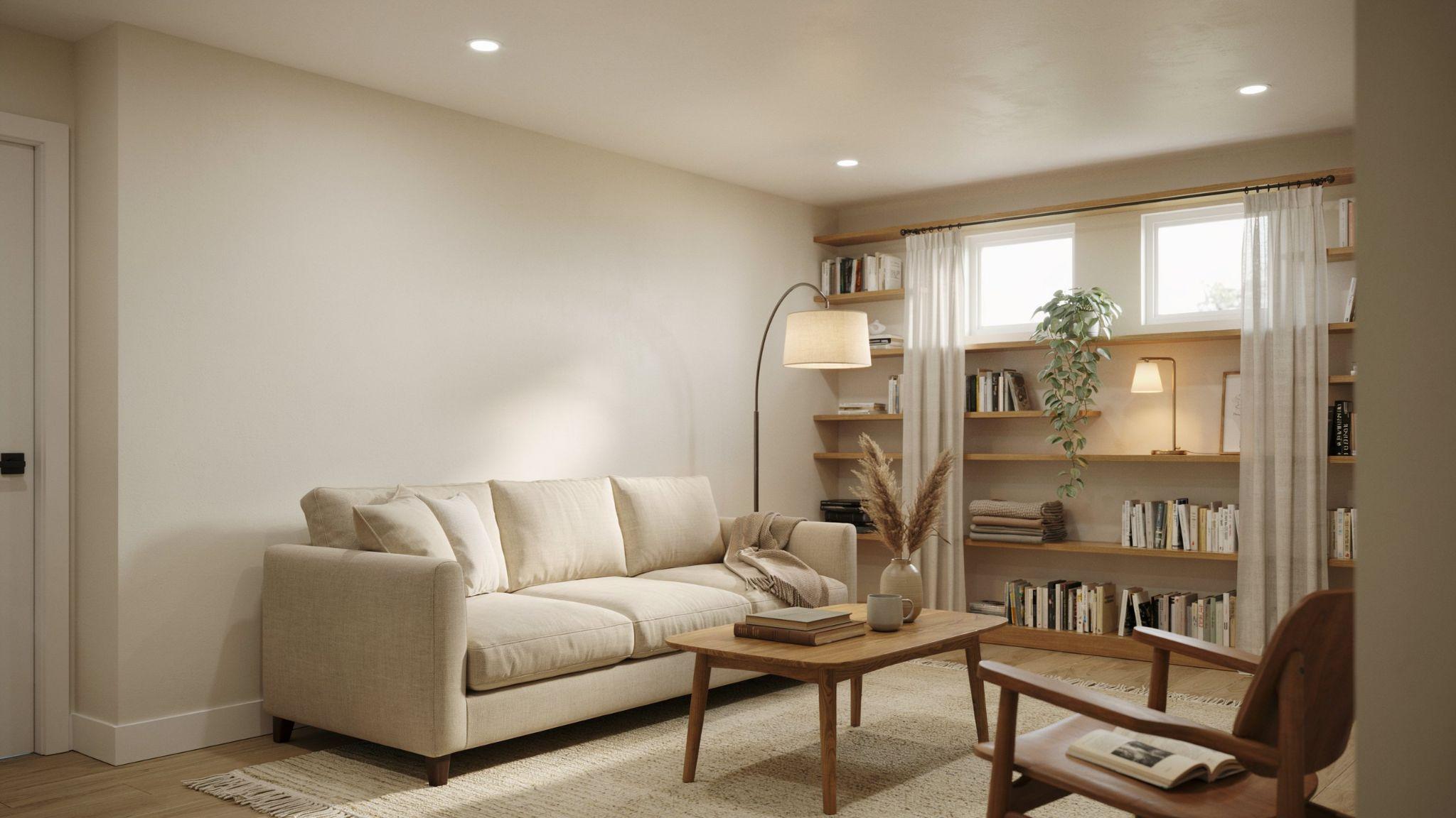
Cream Delight is a warm, soft cream that sits between white and beige. It has a light, welcoming quality that makes basements feel cozy and well-lit even when natural light is limited.
This color is a great choice for basement bedrooms, family rooms, and any space where comfort is the priority. The cream tone adds warmth without feeling heavy.
Pair it with warm whites on the trim and natural or wood-toned furniture for a cohesive, comfortable look.
Expert Tips for Choosing and Testing Basement Paint Colors
Small steps before painting can save you from big regrets later.
- Buy a small sample pot and paint at least a 12×12 inch swatch on your actual wall before buying a full gallon, then live with it for two to three days before deciding
- Check your swatch in the morning, afternoon, and evening under your overhead lights to see how the color shifts with different light sources
- Hold your swatch next to your flooring and furniture to catch any undertone clashes, since a color that looks great alone may look off next to your existing decor
- Paint your ceiling one or two shades lighter than your walls or use a white near-white shade to make the room feel taller and more open
- Add a single dark or bold accent wall to bring depth and a focal point to the space without closing it in, then keep the other three walls lighter to balance it out
Conclusion
I've worked with a lot of basement spaces, and I always come back to the same advice, start with your lighting, think about how you'll use the room, and test before you commit.
I once chose a color I loved online, only to find it looked completely different under my basement's fluorescent lights. That experience taught me a lot.
The best basement paint colors don't have to be complicated. Pick a shade that fits your space, test it properly, and go from there.
Drop a comment below with your favorite basement color pick, or share this post if it helps you. I'd love to hear how your space turns out.
Frequently Asked Questions
What are the best basement paint colors with no natural light?
Stick with high-LRV shades in warm whites or soft greiges. Chantilly Lace and Agreeable Gray both perform well in windowless spaces. They reflect artificial light effectively and keep the room feeling open.
Should basement walls be light or dark?
Light walls are generally better for basements with limited light. Dark shades can work in specific rooms like home theaters but tend to make small or low-lit spaces feel smaller.
What color makes a basement look bigger?
Light, cool-toned shades make basements look bigger. Soft whites, pale grays, and muted blue-greens all visually expand a space. Keeping the ceiling lighter than the walls also helps.
What is the best paint finish for basement walls?
Satin is the most practical finish for basement walls. It has a slight sheen, resists moisture, and is easy to wipe clean. It's a better long-term option than flat or matte.
Are warm or cool paint colors better for basements?
It depends on the basement's use. Warm tones feel cozy and inviting, great for family rooms and guest bedrooms. Cool tones feel calm and focused, making them better for offices and theaters.