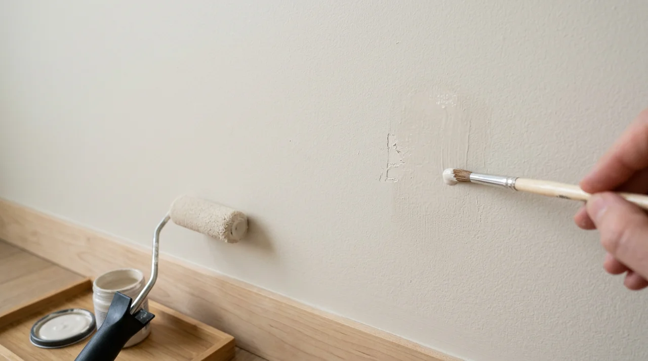


Your front door is the first thing people notice. It sets the tone for your whole home.
I've spent a lot of time helping people pick the right house door colors, and I know how much a single shade can change everything.
In this article, I'll walk you through 19 color ideas that actually work. You'll also learn how to pick the right one for your home and make it look its best.
We'll cover why door color matters, 19 color ideas with tips, how to choose the right shade, and ways to make it stand out. Let's get into it.
Why Choosing the Right House Door Colors Matters
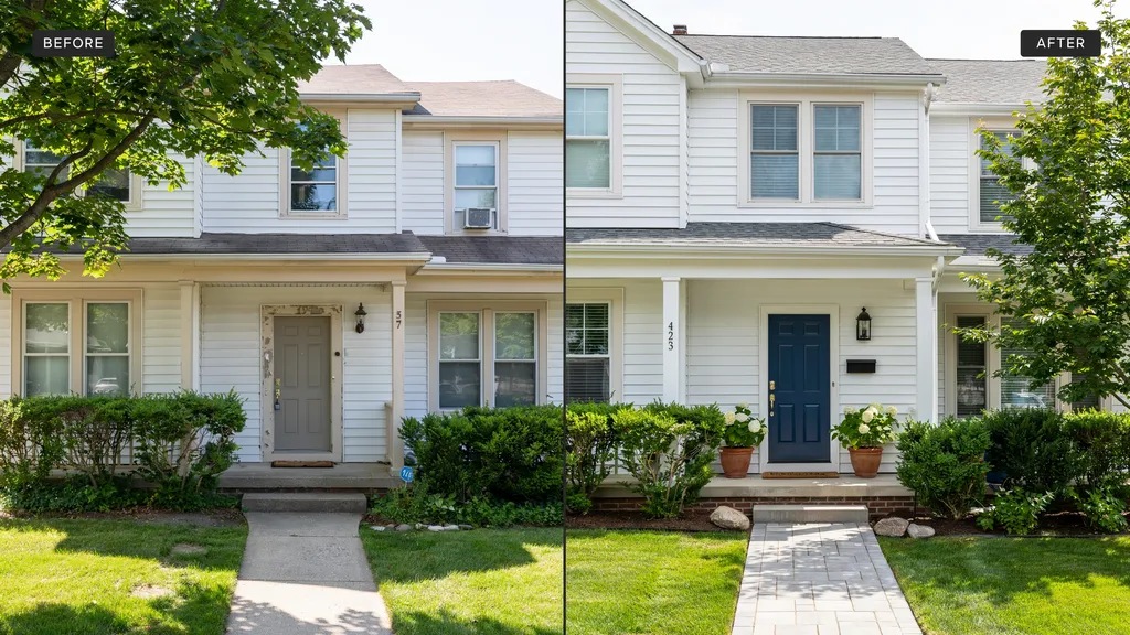
The color on your front door does more than look good. It shapes how people see your home.
People form an opinion in seconds, and a well-chosen color makes your home look cared for and inviting. It can even raise your home's value.
Your door also says something about you. A bold red shows confidence. A soft blue feels calm and easy. Pick a color that feels like you.
The right shade ties your home's whole look together. It can highlight great features or draw the eye away from less attractive ones. Small choice, big impact.
19 House Door Colors to Convert Your Entrance
Here are the top picks that work for all kinds of homes and styles.
1. Dark Green for a Natural, Perfect Look
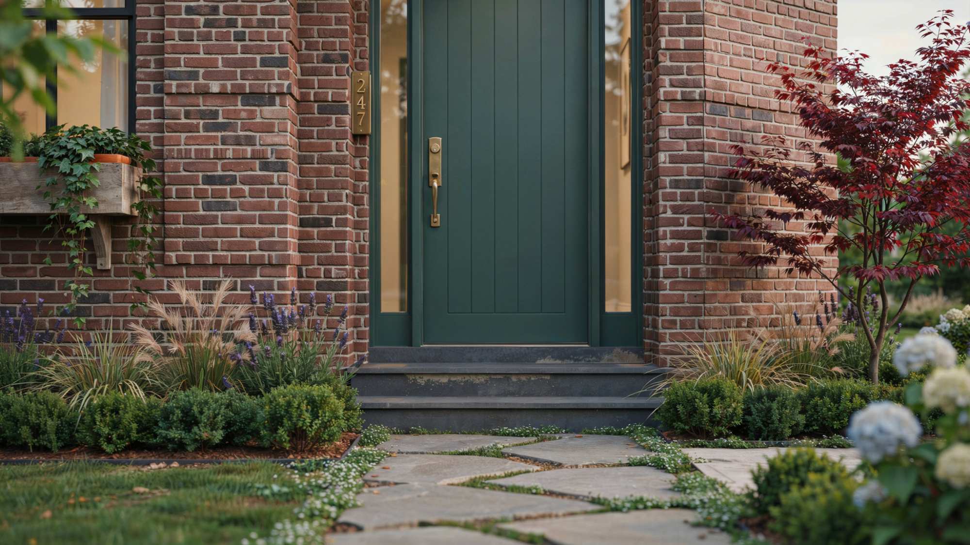
Dark green works well with brick, wood, and stone homes. It feels grounded and calm without being too heavy.
Pair it with brass or gold hardware to bring out its warmth. It is a solid choice for homes surrounded by trees or gardens.
2. Charcoal Gray for a Sleek Modern Style

Charcoal gray gives your entrance a clean, sharp look that feels current. It works great on modern and minimalist homes with simple lines.
Pair it with chrome or black fixtures for a polished finish. It also holds up well in different lighting conditions.
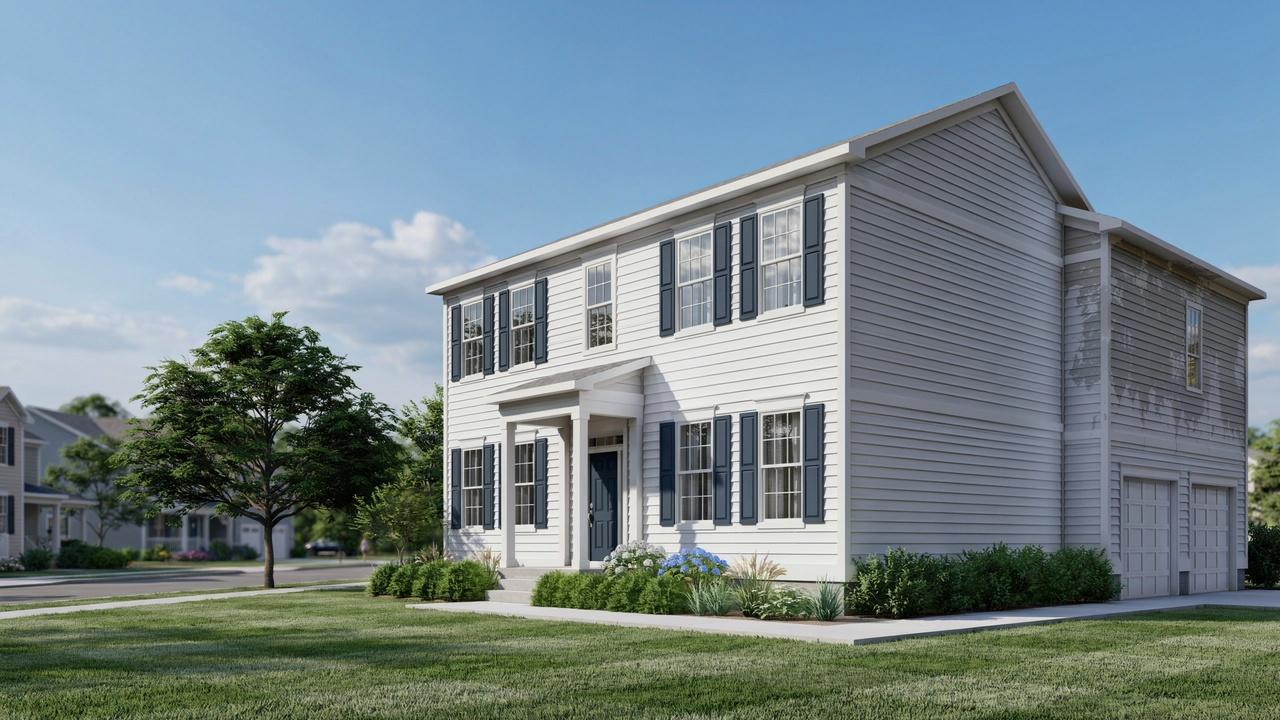
3. Classic Navy Blue for Timeless Appeal
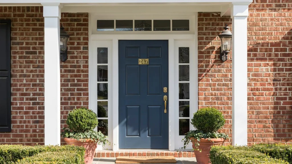
Navy blue never goes out of style and works across many home types. It looks sharp against white trim and light-colored walls.
It suits both traditional and newer homes with equal ease. If you want a safe but strong choice, navy is hard to beat.
4. Bright Red for a Bold Statement Entrance

Red is a classic door color that draws attention right away. It feels welcoming and confident at the same time. It works best on white, gray, or brick exteriors where it can really stand out.
Even a single coat can completely change the feel of your entrance.
5. Sunny Yellow for a Warm Welcome
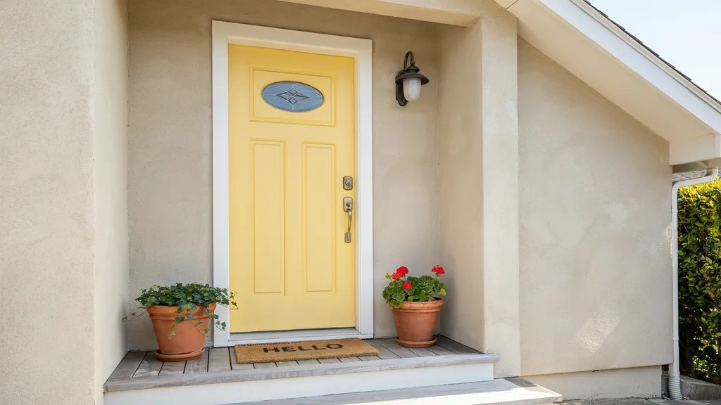
Yellow brings energy and warmth to any front entrance. It works best on homes with neutral or white walls that let the color shine.
Keep the shade on the warmer side rather than going too bright or neon. It is a great pick for homes that feel a little flat or plain.
6. Black for a Dramatic Effect

Black is bold, timeless, and suits almost every type of home. It makes your hardware and fixtures pop against the dark background.
It gives the entry a polished, finished look that feels intentional. If you want drama without going colorful, black is the answer.
7. Crisp White for a Clean and Minimal Look
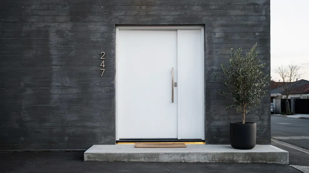
White doors feel fresh, open, and easy on the eyes. They work especially well on homes with bold or dark exterior walls.
White is simple to match with almost any trim or hardware color. It always looks put together without requiring much thought.
8. Soft Beige for Subtle Charm
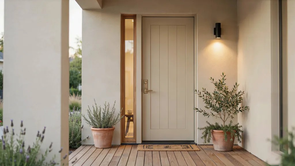
Beige is quiet but surprisingly effective as a door color. It blends naturally with earthy tones, wood, and natural materials.
It is a good pick if you want something calm, classic, and easy to live with. It will not clash with much and ages well over time.
9. Muted Pastels for a Gentle Pop of Color

Soft mint, pale pink, or dusty lavender can add personality without going overboard. These shades work well on cottages, bungalows, or homes with a lighter, softer feel.
They add color without feeling loud or out of place. A great option if you want something a little different but still easy on the eye.
10. Light Blue for a Coastal Feel
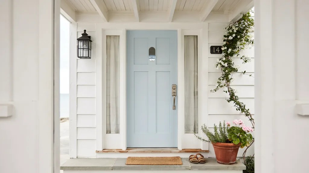
Light blue feels airy, relaxed, and open. It works well on homes near the water or those with a casual, laid-back vibe. Pair it with white trim for a clean, fresh finish that feels put together.
It is one of those colors that just feels right in the right setting.
11. Teal for a Trendy, Refreshing Touch
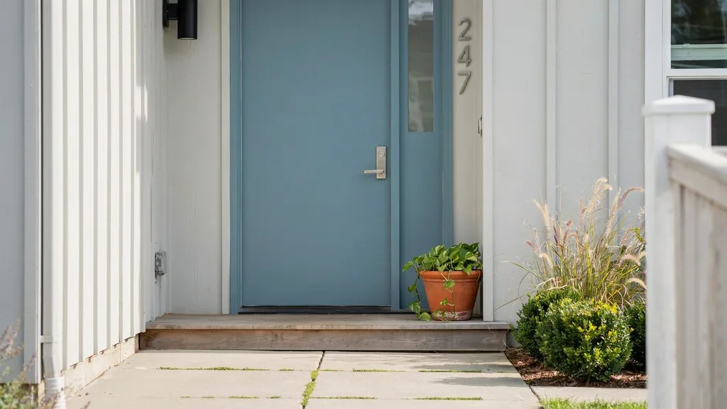
Teal sits right between green and blue, giving you the best of both. It looks striking on both light and dark home exteriors.
It adds real character to your entrance without feeling too loud or bold. A great pick if you want something current and full of personality.
12. Forest Green for a Rich, Earthy Tone
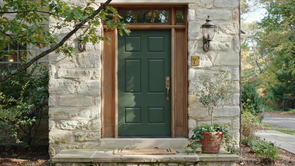
Forest green is darker than sage but softer than hunter green, sitting in a sweet spot. It gives your entrance a rich, natural feel that works well year-round.
It pairs especially well with wood accents and stone details. A grounded, reliable color that rarely feels out of place.
13. Deep Burgundy for a Luxurious Vibe
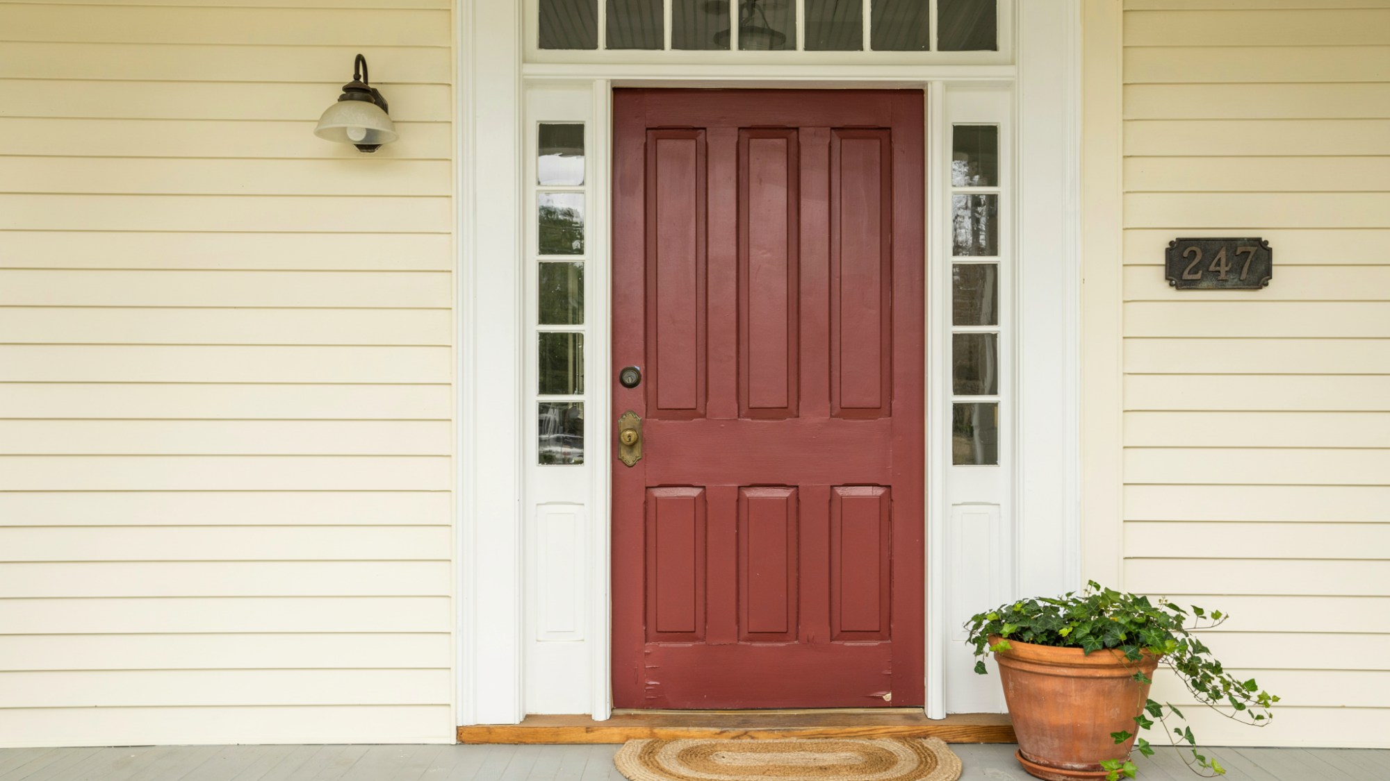
Burgundy adds depth, warmth, and a sense of richness to any entrance. It suits older or more traditional homes particularly well.
Pair it with dark wood or antique hardware to bring out its best qualities. It is a strong color that commands attention in a quiet, confident way.
14. Coral for a Vibrant, Playful Entry
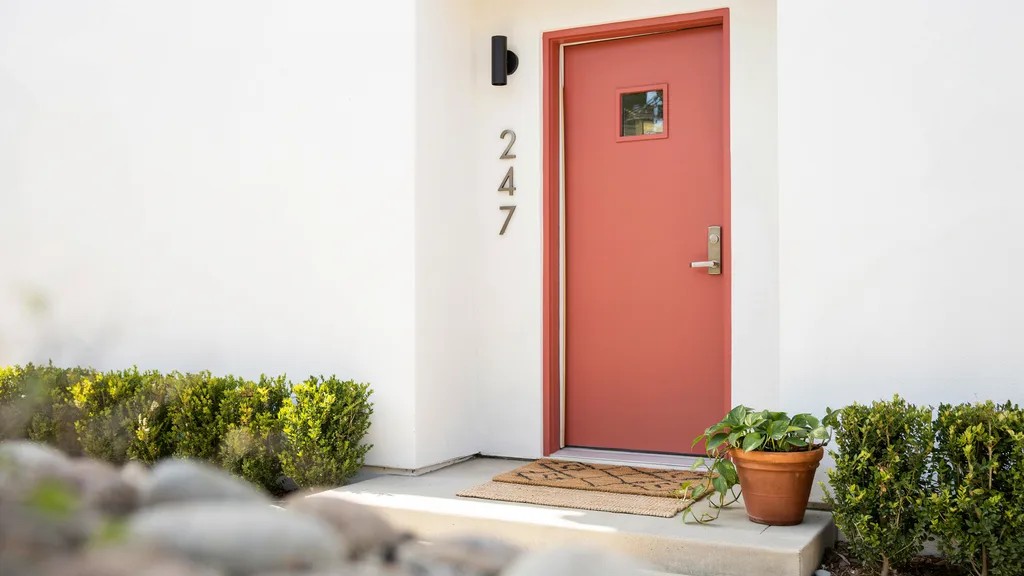
Coral is warm, lively, and full of energy. It stands out beautifully against white or cream exterior walls. It is a great pick if you want something cheerful and a little unexpected.
Not everyone goes for coral, which makes it a fun way to set your home apart.
15. Lavender for a Soft, Standout Look
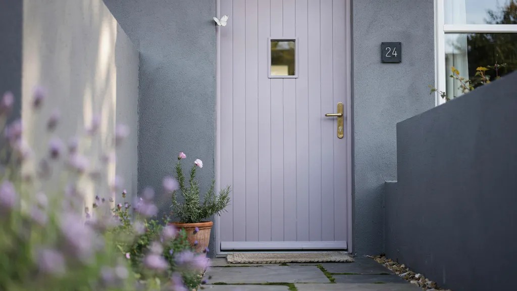
Lavender is gentle but leaves a lasting impression. It works well on homes with gray or white exteriors where it can shine without clashing.
It adds a calm, slightly playful touch that is hard to find in other colors. A great option if you want something soft but still memorable.
16. Warm Brown for a Natural Wood-Influenced Style
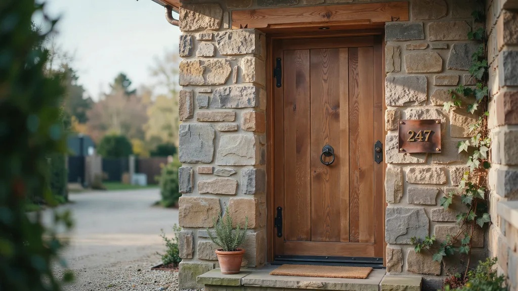
Warm brown gives you the look of natural wood without the maintenance that comes with it. It blends well with stone, brick, and earthy wall colors.
It feels organic and grounded, making it a natural fit for rustic or traditional homes. Simple, warm, and always in good taste.
17. Orange for a Bold Contemporary Edge
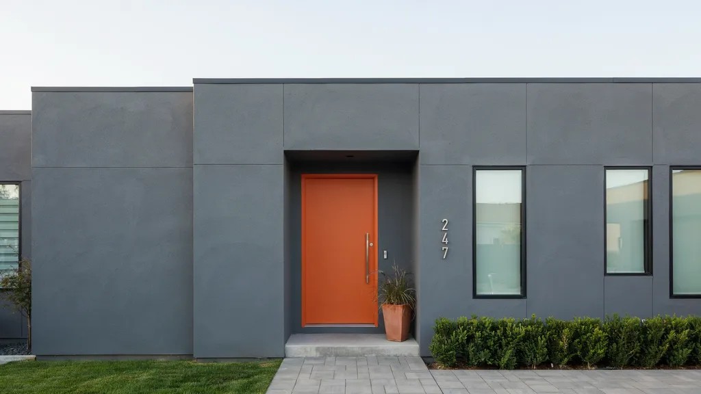
Orange is daring, modern, and hard to ignore. It pops strongly against gray or white home exteriors.
If you want your entrance to grab attention and make a statement, orange delivers every time. It takes confidence to go for it, but it almost always pays off.
18. Pink for a Charming and Cheerful Entrance
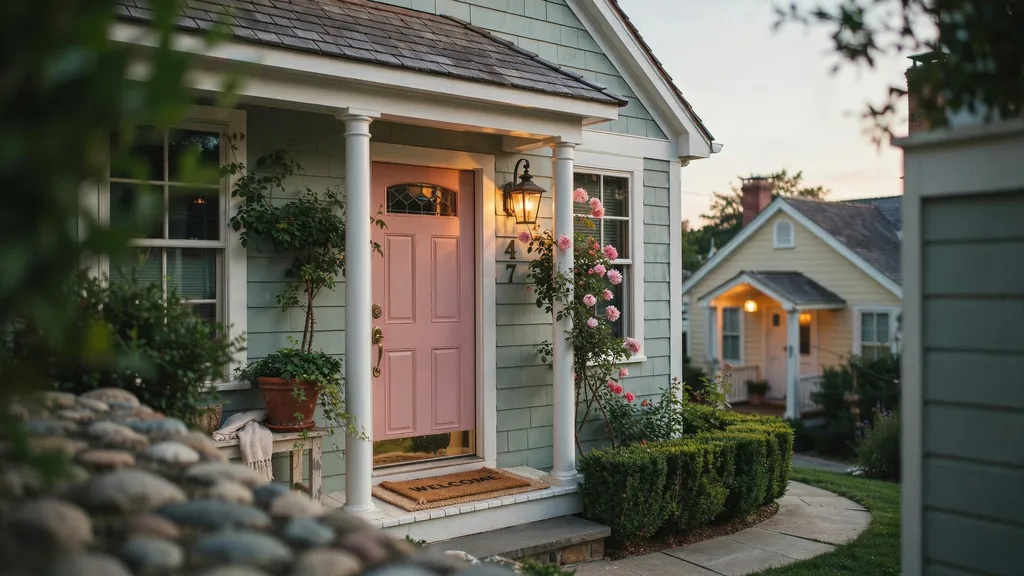
A dusty or blush pink can look surprisingly put together and stylish. It adds charm and warmth without being too loud or overwhelming.
It works especially well on cottages, bungalows, and older-style homes. More people are reaching for pink lately, and it is easy to see why.
19. Two-Tone Combinations for Creative Contrast

Painting your door frame a different color from the door itself adds depth and visual interest. Try combinations like black and white, navy and gray, or green and cream for a layered look.
It is a simple way to make your entrance feel more considered and designed. Two colors used well can do more than one color used alone.
How to Choose the Best House Door Colors

Picking a color is about more than personal taste. A few key factors can help you get it right.
Match with Exterior Walls and Trim
Look at your home's existing colors before choosing. Your door should work with the walls and trim, not fight against them. Use a color wheel to find complementary or contrasting shades.
Consider Lighting and Surroundings
Natural light changes how a color looks. Test your color at different times of day. Also think about the trees, plants, and neighboring homes around you.
Decide Between Bold vs Neutral Shades
Bold colors make a statement but need more thought. Neutrals are safer but can still look great. Think about what feels right for your neighborhood and your style.
Think About Long-Term Style and Trends
Trends come and go. Pick a color you'll still love in five years. Classic shades like navy, black, and forest green tend to hold up well over time.
Tips to Make Your House Door Color Stand Out
A great color is just the start. These small steps can take your entrance even further.
- If your walls are light, go dark on the door and vice versa. Contrast draws the eye naturally and makes your entrance feel intentional.
- Your door handle, house numbers, and light fixtures should all work together. Match your metals and finishes for a look that feels complete.
- Always test a paint sample on your actual door before making a final call. Colors look very different on a small chip compared to a full surface in outdoor light.
- Use paint made specifically for outdoor use. It handles heat, rain, and sun far better than regular paint and stays looking fresh for longer.
- Keep your overall exterior in mind when picking a finish. Matte works well for a modern feel while semi-gloss holds up better in high-traffic areas and is easier to clean.
Conclusion
Choosing the right house door colors does not have to be hard. I always tell people to start with what they love and then match it to their home.
Even one coat of the right color can completely change how your entrance feels.
Try one idea from this list and see how it works for you. If you found this helpful, leave a comment below or share it with a friend who is planning a home refresh.
I'd love to hear which color you go with!
Frequently Asked Questions
What is the most popular house door color right now?
Black and navy blue are among the top choices right now. Both look sharp, work with many home styles, and hold up well over time.
Can I paint my front door a different color from the rest of the house?
Yes, your front door is meant to stand out a little. Just make sure the color works with your wall and trim shades.
How often should I repaint my front door?
Most front doors need repainting every three to five years. High-traffic areas or harsh weather may mean you need to do it sooner.
Does front door color affect home value?
Yes, it can. A well-chosen door color improves curb appeal, which can positively influence a buyer's first impression and even the sale price.
What colors should I avoid for a front door?
Very bright or unusual colors can be risky if they clash with your home's exterior. Colors like neon green or hot pink may not appeal to most buyers if you plan to sell.